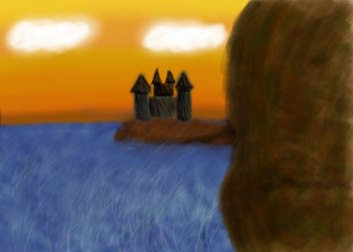
This is the speed painting from last thursday. I used mostly custom brushes. To get the texture in the sky I made a brush from a cool ciruclar shape in alchemy. The clouds amd trees are a custom brush to get a lot of little implyed detail really quick. -Matt C
Wednesday, September 22, 2010
PROJECT 1

I feel that my work for project 1 really reflects my style as an artist. The thought process was that reality or painting something realistic would be boring. I wanted to create something, a character, from my imagination. I have a series of drawings in my sketch books where I just draw a crazy shape, then from that drawing I develop a character. I look at it and say "oh ok theres the mouth, eyes, etc". This particular character is a walrus squirrel hybrid. I guess its a Squirrus. In this painting the Squirrus is on a journey. I imagine he was a country Squirrus dreaming of the big city and the painting somewhat outlines the path and distance it will take him to reach the city.
I really liked the painting style I fell upon. It came about as I was trying to draw fur on the Squirrus. I am really not good with tablet yet and the whole concept of digital painting has really been challenging me as an artist (in a good way of course). Being a beginner and all, I started doing these scribbles and then going over scribbles with more scribbles and developing shading and I thought the results were turning out great so I continued the scribbled effect throughout the entire painting.
Tuesday, September 21, 2010
Wizard
Fortress Speed Paintings


Was in something of an ancient civilization mode since Civ V came out.
The monochrome image was done in LivePaint, and the colored on in Photoshop.
Fantasy Character Painting-Sven

Started with the lineart of the character on a grey background, added the values over it, added the color between the two, and did the background underneath everything. I used some custom brushes for the wood on the supports and the rock wall. The shading was done using both freehand brushes and gradients.
Project 1
For my Project 1, I decided to create a griffin. His head and body is mainly based off of a bald eagle with a few modifications (such as the obvious color and head additions). Griffins are large flying creatures that I always picture having the easiest time living on cliffs where they can take off by simply running to the edge and gliding off as opposed to trying to lumber up from standing still on the ground. So that's why the background is a cliff face.My workflow was pretty simple. I did outlines of both the griffin and the environment. Then I added color on top of it in different layers and at different opacities. I used the smudge tool a lot especially on the sky and the lower layers of both the environment and the creature. Each separate element basically has its own layer. The sky, cliff, and the two levels of trees have their own layers. There's a small adjustment layer on the sky as well. The griffin's beak and eyes are separate layers from the actual body which is made up of about four or five different layers, each with varying colors and opacities on them. The higher layers of the eagle are more transparent, allowing some of the color variations created on the lower layers through use of the smudge tool to show through slightly.
Project 1 -- Partners?

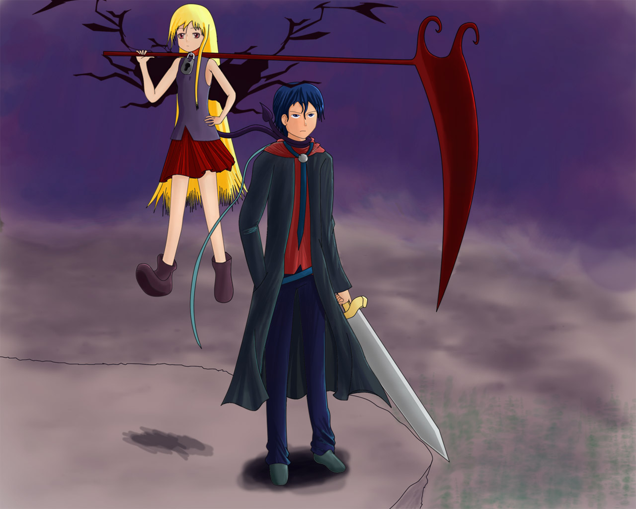
"Looks can fool you; even though they travel and fight together, neither would admit that the other is their partner. The male, brought up to be both a powerful sorcerer and a mighty warrior, summoned the demon girl to serve him. When he did, he put a necklace with a lock on it that keeps her power from growing too unstable for him to control, so he sees this as a master-slave relationship. The demon girl on the other hand, highly knowledgeable in the use of magic, promised the male that she'll kill him the second she figures out how to get the necklace off, so she constantly keeps her tail wrapped around his neck. The male thinks nothing of this, confident in the charm around the girl's neck. Besides, he's too preoccupied searching for an ancient relic said to contain untold power. He needs this so he can take down the oppressive dictator who rules cruelly over these lands."
This idea popped into my head while I was sketching random things for this project and I liked it, so I just went with it. This is actually my first time doing basically everything with a tablet (which I'm still getting used to) so it's not quite as clean as I'd like it to be, but it came out alright. However, I can definitely see spots that could look a lot better... been too long since my last big project, my drawing abilities lowered (ΘεΘ) (Now I get to obsess over this and spend tons of time practicing, yay~)
Alright, as for techniques I used. I started by making sketches of different poses/environments. Out of all of them, these simple poses and the cliff environment felt like they worked the best for me. After choosing those, I used the pen tool to make lines (it's the only thing I didn't use the brush tool/tablet for). After making the lines, I used the magic wand tool to make it easy to get base colours into their respective areas without going over another colour. Then I locked the transparencies and began adding shadow/highlights. For shadows I used a low opacity (about 30%) brush set to multiply for a few strokes. For highlights, I set the brush to a hard, small sized, high opacity (about 70~80%) and did a couple of light strokes.
I'm not really sure what else to put other than, if you want to be good (better than me, I'm not good yet, I'm okay) then practice till your hands bleed, then paint with the blood! (I'll bet that would make an interesting piece :P)
Monday, September 20, 2010
RAWR ~ Project 1 - The Healer
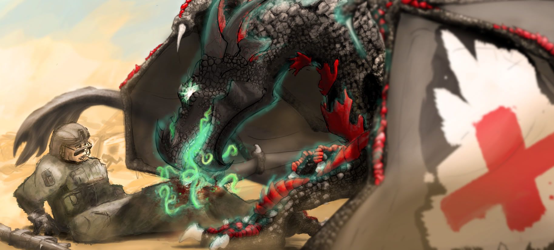
It has been a long road to finish this piece. I've actually been working on it for almost half a year. School kept interfering so there'd be long periods between each little snippet. This painting is actually a commission that was ordered by a friend of mine for her friend who was over-seas. She told me he loved dragons and was a medic over there. So with those two pieces of information, I created this scene. Originally, bullets were going to be bouncing off the dragon's wings, but I couldn't figure out how to transfer the image in my mind onto the canvas.
If the story isn't obvious, the dragon is a medic in the army (a secret "weapon"!) who goes around healing injured soldiers. You're probably asking, "Why is a dragon healing instead of pew pewing with fire?" well most dragons in this universe promote that war is pointless and they would rather solve differences over a good brew of whiskey than blow other species up. In this scene, the dragon is healing the soldier's severely broken leg in the midst of a battle.
Getting the perspective correct on this piece as a pain in the ass... and I'm pretty sure there are a few places that don't seem right. Especially with the human. Bah! I hate drawing humans. I can never truly get them down. Also, I kept forgetting where the brush I used to color the scales was. I'm still not 100% sure if I used the same brush for all scales and such. I got a little lazy with the human. Again, I hate humans. One thing I've made note of is that I need to practice on machinery. My gun is lacking.
There's so much to go over for techniques. The #1 method I use is having a base color then painting the shadows then highlights then uber highlights. You could also do greyscale painting where you paint all the shadows and highlights first then color the painting with a layer on Overlay. I switch back and forth between these two methods, they can each come out different. However, when I want something vibrant, I usually don't go greyscale.
One thing you need to keep in mind when painting is that you need to constantly give depth to your picture or it seems very flat. A way I accomplished this in this painting is blurring the wing closest to the viewer like a camera with depth of field. One other note on blurring.. once you've blurred an area, I suggest very lightly sharpening the area that is your focus. Not too much though or you ruin the image with disgusting vibrant dots.
With sand you need to have the entire picture with a gradient of yellows and oranges. With this image, I put a Photo Filter adjustment layer and set it to Warm so that the entire image gives this "in the sun" feeling.
Please do not steal or use this image in any way, shape, or form.
EDIT :: I've updated the image with a cropped version. Decided that the left wing was being shown too much.
Sunday, September 19, 2010
RAWR ~ Something that flies
This is my phoenix speed paint for the "thing that flies". It's not completed yet, I still have more to do, especially the head.
Saturday, September 18, 2010
Friday, September 17, 2010
Silhouette Thumbnail Technique
This technique of using a big brush and drawing small forces you to not add detail. You can draw quickly and make 10-30 silhouettes exploring different looks and styles. Then pick one you like best and sketch it larger so you can add detail.
Laying in the Shadows
These videos were captured for my concept art class but is still relevant for our class.
Something sci-fi

This is the second attempt at the something sci-fi speedpaint. the crystals are inside asteroids, and groups of ships fly into asteroid belts attaching charges to them and blowing them open. If they contain the crystals, the second wave of ships (the one pictured in the, um, picture) are sent in to harvest them. They attach to the asteroids for easy of moving back and forth.
edit: really, really bad wording. Asteroids in asteroids.
Something that flies
Hobbitron
Thursday, September 16, 2010
Week 2 Speedpainting-Bat

This was pretty fun. First, I found an image of a bat on Google for reference. Then I laid down the base color as a bat-shaped silhouette and defined the shape of the limbs and the head in shading, rather than sketching out a base drawing. It was a little confusing at times, since I was basically shading a paper cutout, but I think it turned out pretty well

Speedpaint for scifi thing. I pretty much scribble out ideas as fast as I can and build off of them. I then build up lighting and other aspects. The whole idea is to get the form down first so that it can be read by a viewer easily. If I had more time I think I could make something much more interesting.
Wednesday, September 15, 2010
A sci fi char that flies
Star-Ship
I did this one at midnight for about 15-20 mins last night. I was sorting through my brushes so I could bring them in with me to class next time. The Star Ship itself was a shape from Alchemy I had made awhile back. I have a few files of random and interesting shapes and this one kind of looked like a spaceship. I did paint on top of it to flesh out its shape. The trees in the foreground where a custom brush I made which I will post a break down on how to make later.-Matt Carey
Tuesday, September 14, 2010
Sci-fi
RAWR ~ Sci-Fi
These are some space entities that are escaping from their exploding star. Originally they were going to be just floating by a window but this looked cooler. Creatures were inspired by the "space dolphins" in Titan A.E.
Something that flies.

For this tree I used a photo for reference, although because it's a speed painting, I didn't put too much into making it accurate. I just sort of painted in a basic shape quickly to get a good composition and then went in with smaller round brushes and the darker browns to get some details with texture and shadow and the smaller twigs. Then with about 5 minutes left I threw in some highlights(I wouldn't normally jump that far ahead) just to see what certain areas of focus would look like.
Monday, September 13, 2010
Fantasy matte
Sunday, September 12, 2010
Tree & eye
My stuff thus far

Here is what I have done so far. Both of my works have been done with just the brush tool. They I used the smug tool as well. for the tree I used different opacities to get the colors to blend. Most of my work is usually done this way. I am thinking about going back to them them to spiff them up a bit for I can potential in both of them. :3
Saturday, September 11, 2010
Eye
Friday, September 10, 2010
The tree

To begin I started my art based on the first song that came on. That song happened to be K' Naan "Wavin' Flag" that was written for the FIFA World Cup 2010. Therefore I started by drawing some trees of the Kalahari Desert and Decided to put a goalie there. So once again I did not finish my picture but the concept and final background have some possibility. Here is a break down of how I laid out the work.
Subscribe to:
Posts (Atom)